Case study
ZuriLit
Visual identity for ZuriLit – a professional network connecting Lithuanian professionals in Zurich.
- DELIVERABLES
- Visual identity · Logo design · Digital design
- YEAR
- 2024
- CLIENT
- ZuriLit
The Challenge
A clear look for a professional network
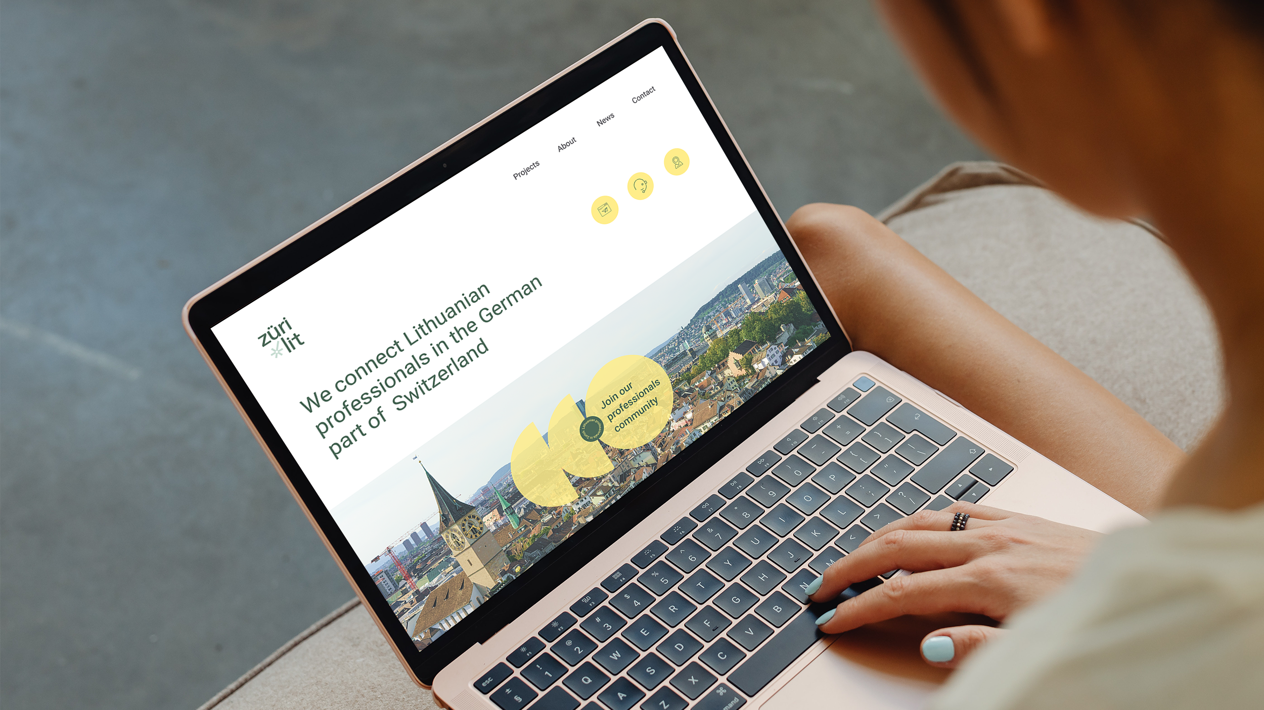
ZuriLit wanted a clearer visual identity that could unite the network under a single, recognizable brand. The goal was to develop a professional and inclusive look that could strengthen communication and function consistently across the website, social media, and other digital platforms.
The name
Zurich + Lithuania = ZuriLit
The name tells the story at a glance: «Zuri» stands for Zurich, «Lit» for Lithuania. The name was already known in the community – the challenge was to give it an expression to match.The old logo felt outdated, and the network needed a more modern and professional face.

The Solution
An identity that creates connections
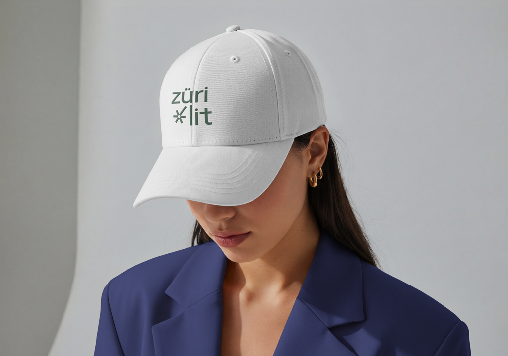
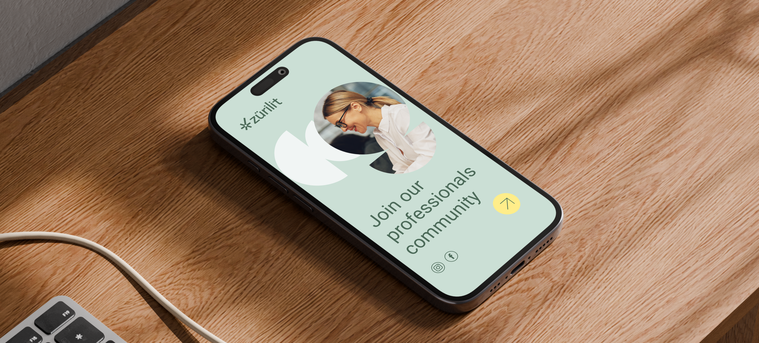
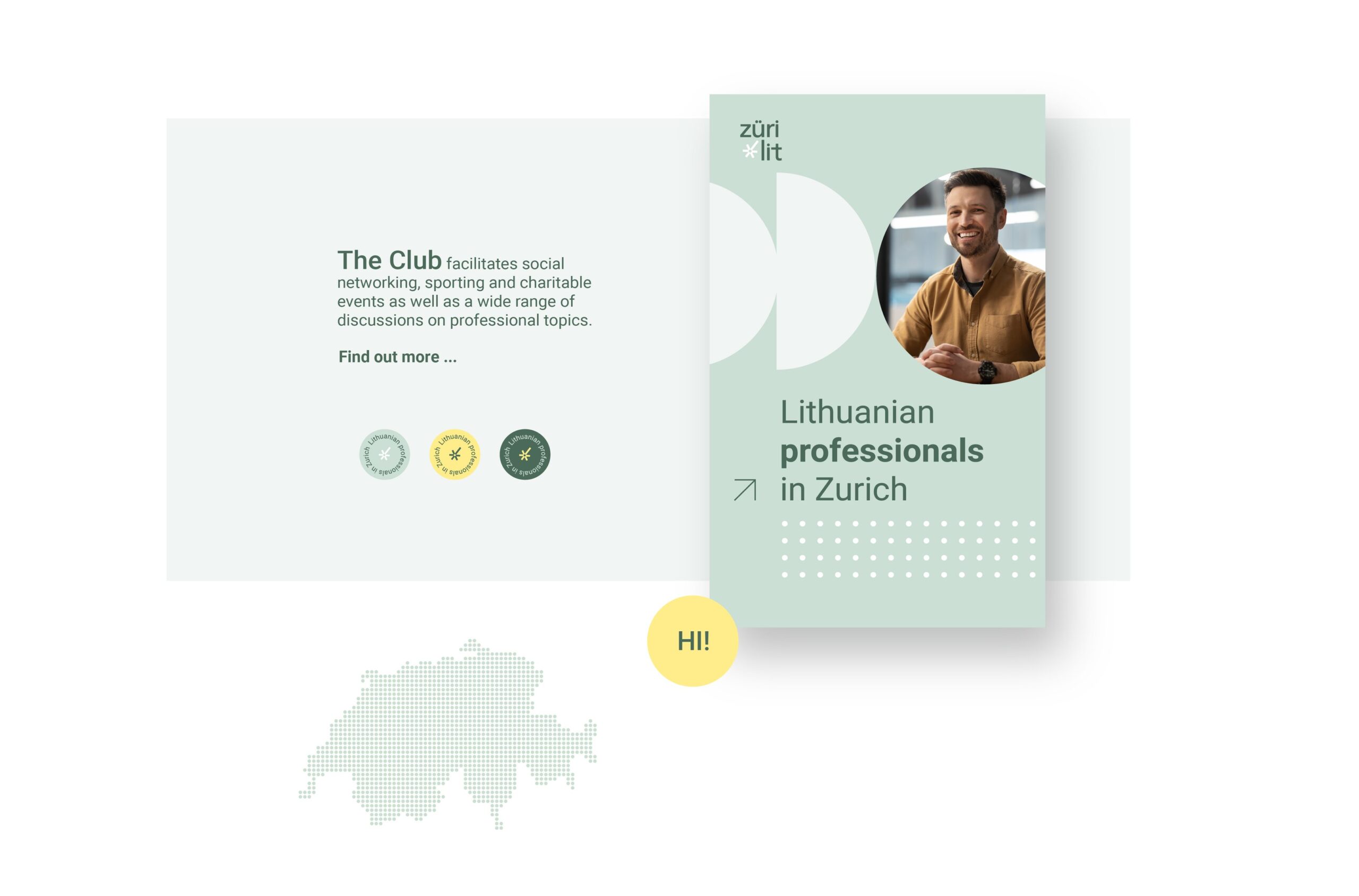
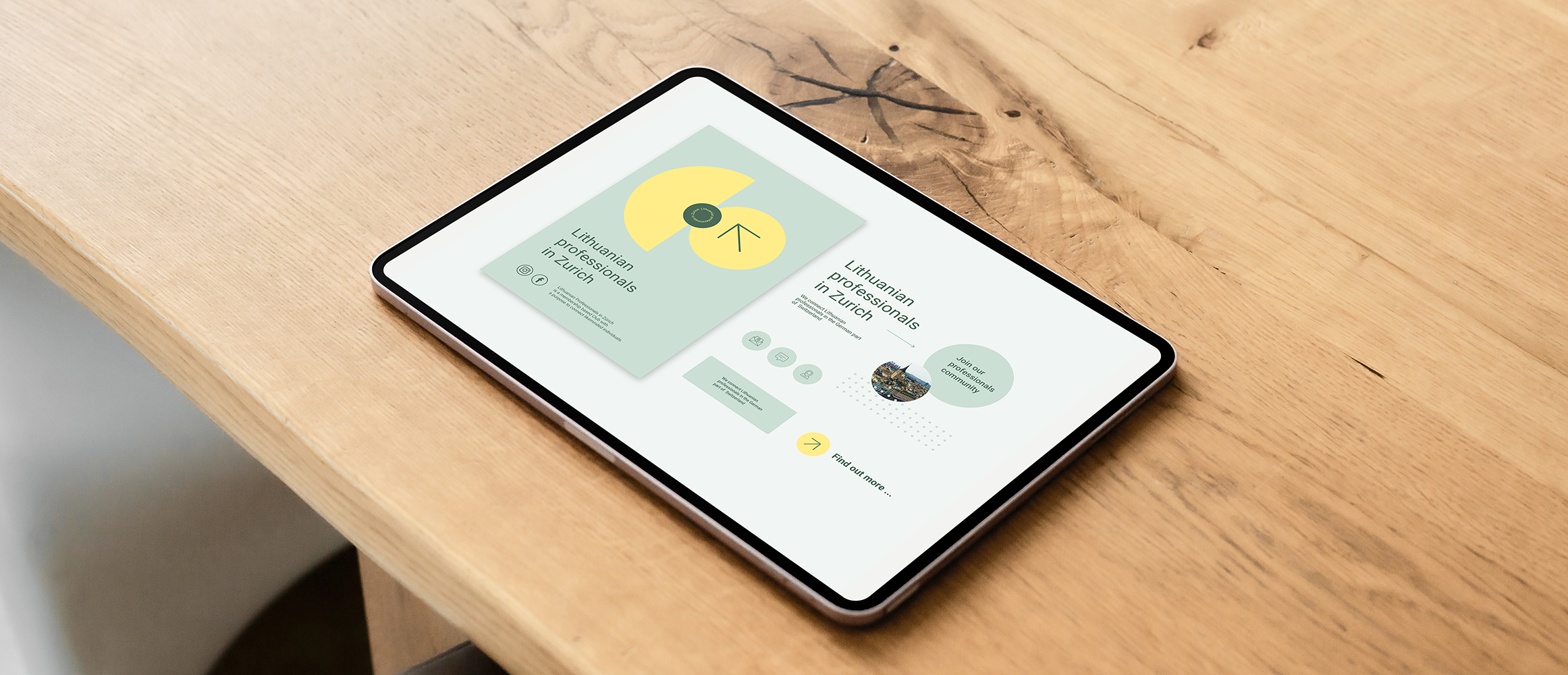
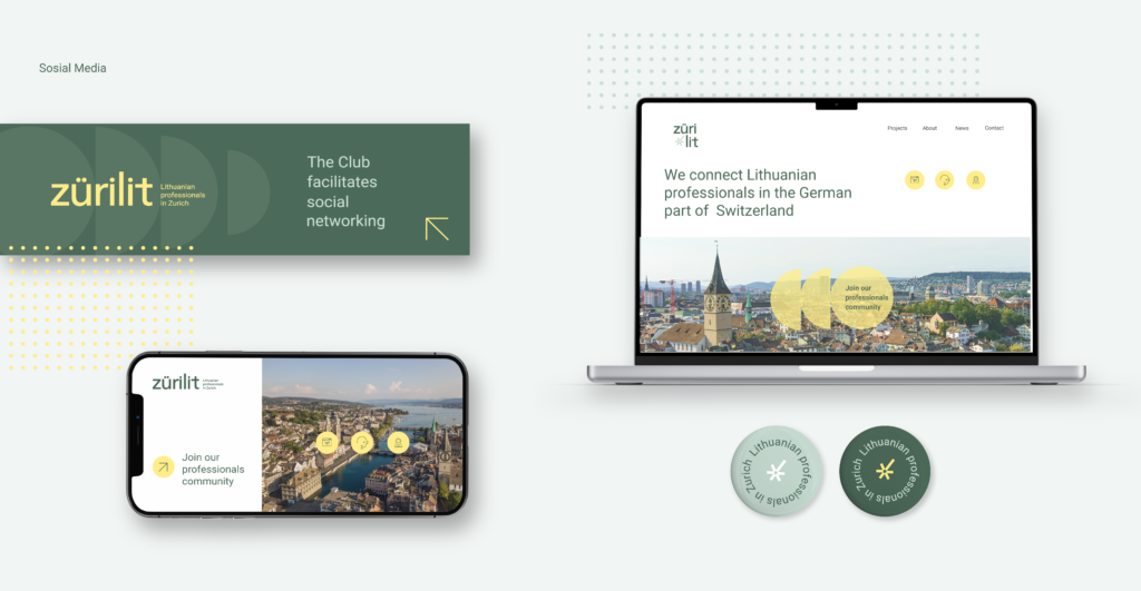
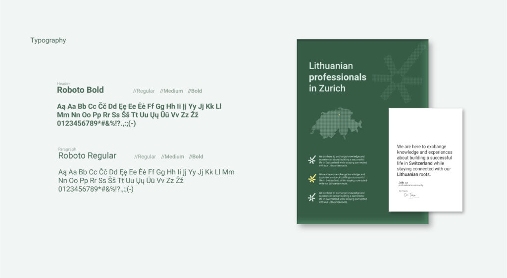
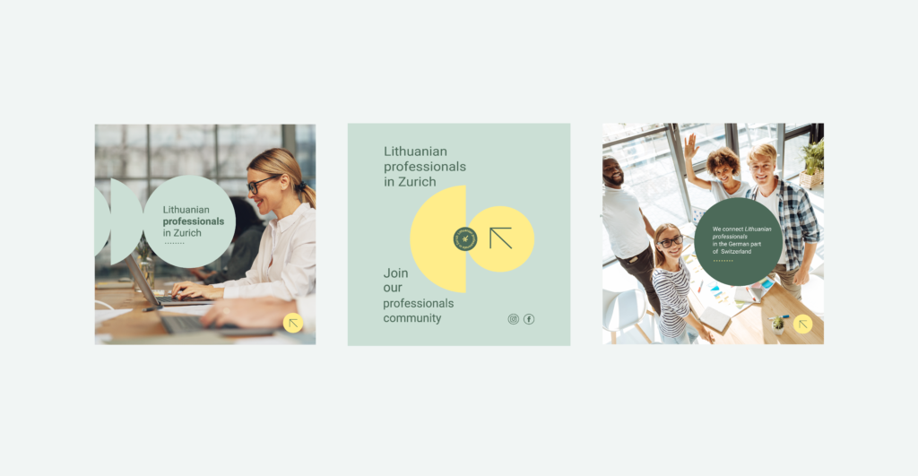
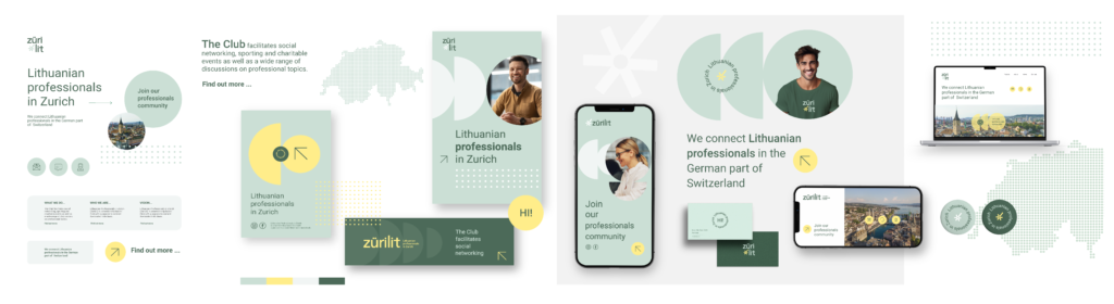
The visual identity was developed as a flexible design system including a logo, color palette, typography, and graphic elements that create a clear and recognizable look.
The process
From old to new
From an outdated logo to a modern, holistic identity – in four steps.
The starting point
An established network with an older logo and an expression that no longer matched its ambitions.
Two cultures, one expression
Swiss precision and Lithuanian identity were to meet in one modern and professional brand.
Two concepts
ZuriLit was presented with two different directions. The chosen direction was developed into the new identity.
Complete delivery
Logo, colours, typography, website and social media templates – brought together in one holistic system.
The result
The result is a comprehensive visual identity with a new logo design, color palette, typography, and graphic elements that give ZüriLit a clear and recognizable look. The design system creates a cohesive thread across the website, social media, and digital communication, and can be easily adapted to different formats and needs. The new identity is in use today, and the client is very pleased with the result.
“A visual identity should not only create recognition – it should make it easier to communicate who you are, across platforms and over time.”