
Case study
KIGA Studio
Name development and visual identity for KIGA Studio – an architecture studio focused on sustainable and human-centered architecture.
- DELIVERABLES
- Name Development · Brand Strategy · Visual Identity · Digital Direction
- YEAR
- 2025
- CLIENT
- KIGA Studio
The Brief
A clear identity for sustainable architecture
KIGA Studio needed a name and visual identity that could unite architecture, sustainability, and human health in one cohesive expression. The goal was to develop a brand that communicates quality, calm, and professional strength – and that functions consistently across digital and visual platforms.
The name
KIGA – trees and green architecture
The studio had no name when we started. It needed to be short, international and easy to remember – while also telling what the studio stands for.The answer was KIGA: «Ki» means tree in Japanese, and «GA» stands for green architecture. Two short syllables that hold both nature and architecture – and work just as well on a sign as in a domain name.
The Solution
A design system inspired by architecture and nature
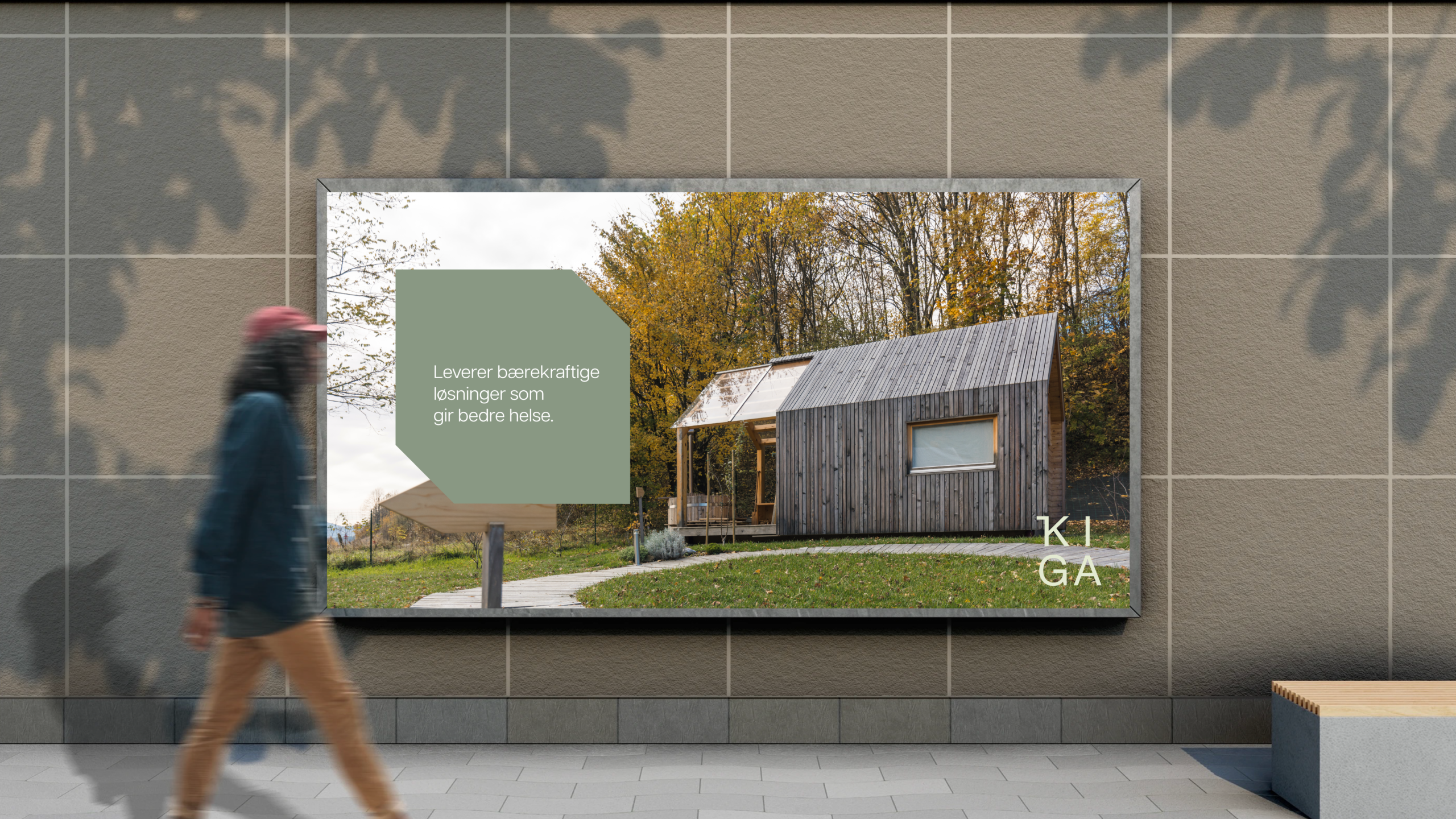
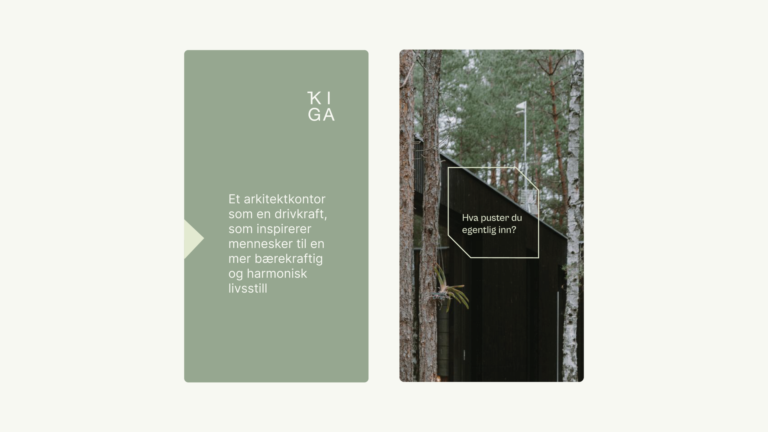
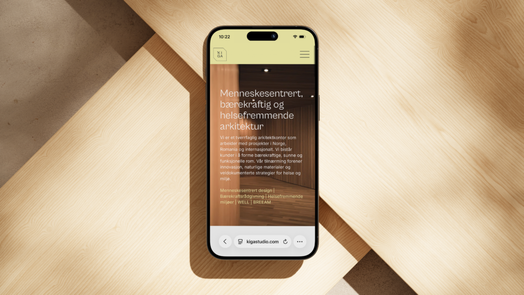
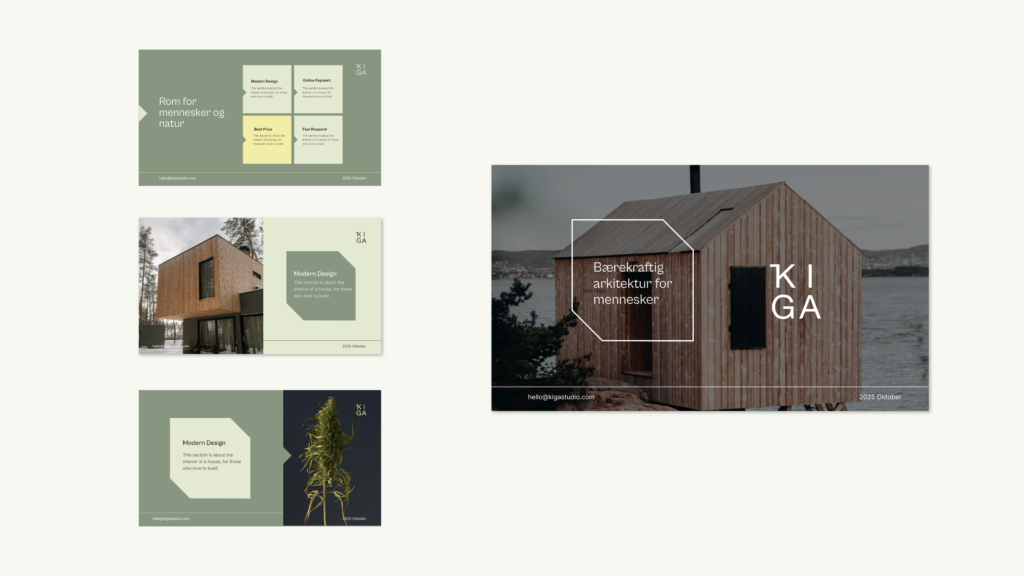
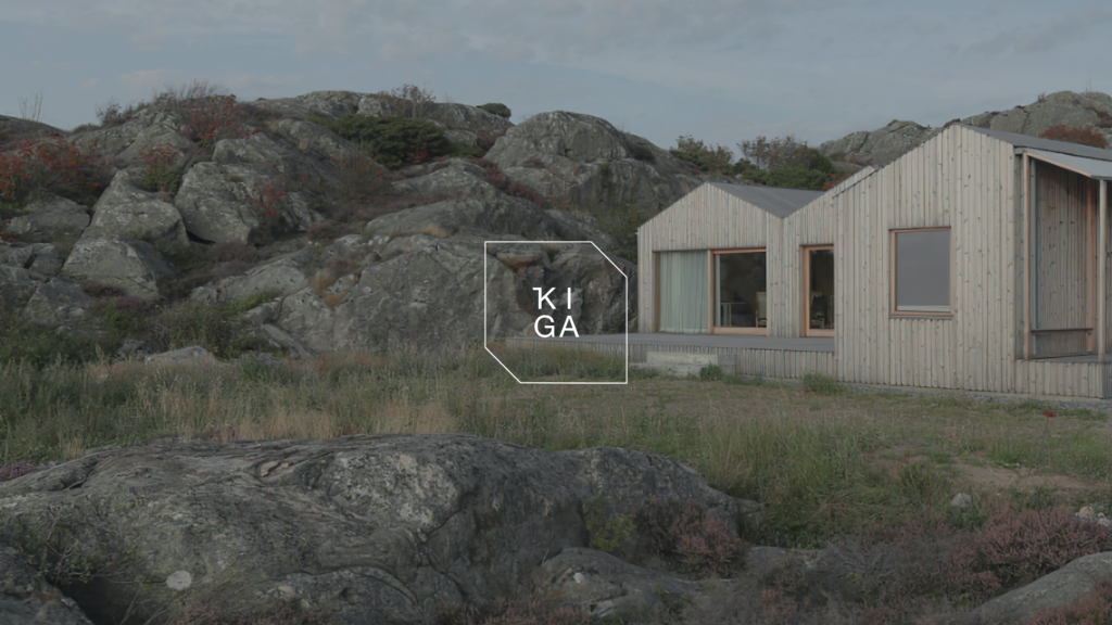
We developed a name, visual identity, and flexible design system that gives KIGA Studio a clear and recognizable position. Natural color tones, geometric forms, and minimalist typography create a modern and timeless expression, while the identity conveys the studio's connection to nature, people, and sustainable architecture.

VISUAL DIRECTION
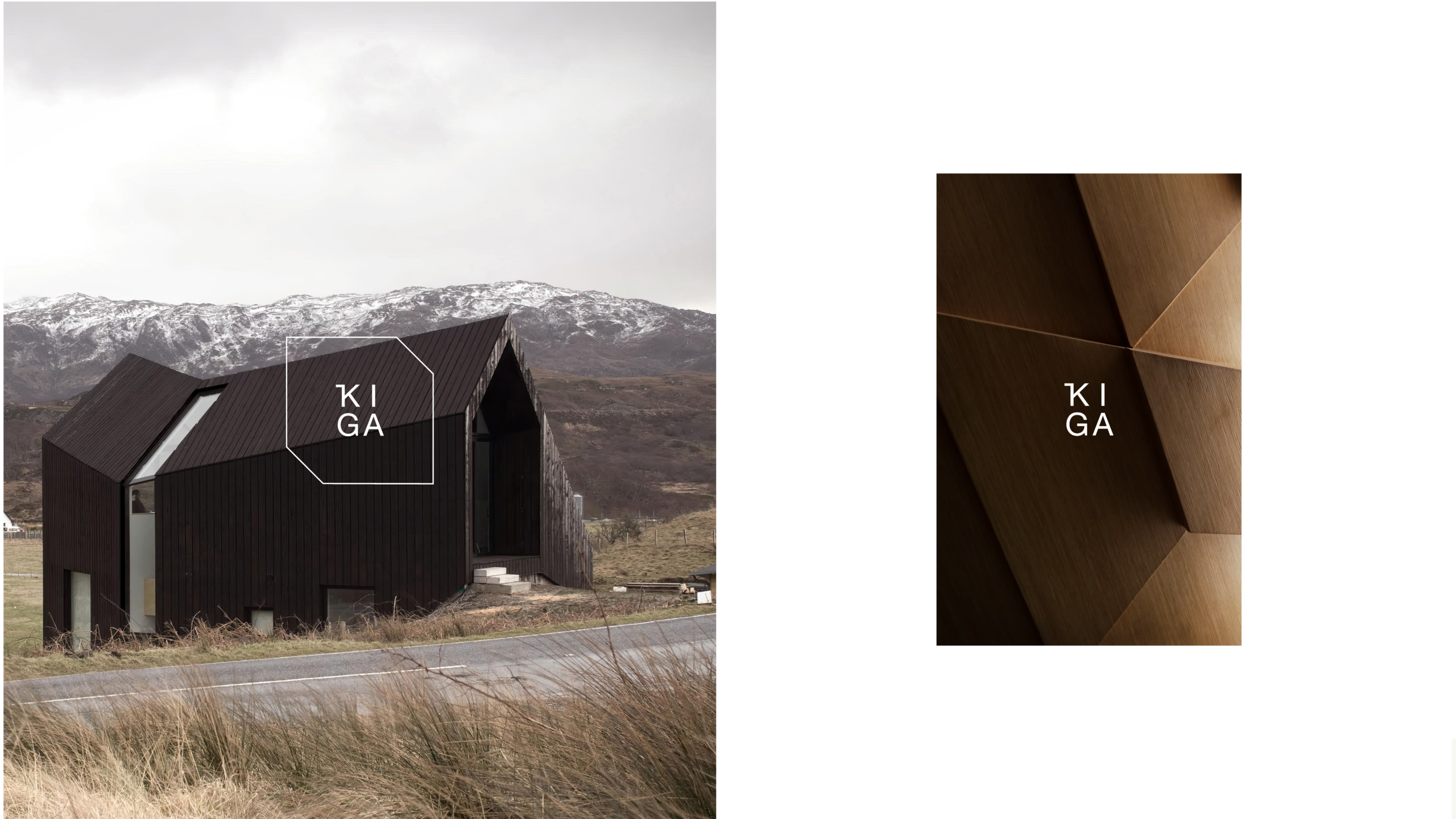
Calm, balance, and architectural precision
The visual direction was developed with a focus on calm, balance, and quality. A muted, nature-inspired color palette is combined with geometric forms and minimalist typography. The result is a flexible expression that feels modern, timeless, and clearly recognizable.
The process
How we worked
From the first conversation to the finished identity – in four steps.
Insight
We started with the studio’s values: sustainability, people and nature. What should the name and identity convey?
Naming
The name KIGA was developed as the foundation for the entire brand.
Three concepts
KIGA Studio was presented with three different directions for the logo and visual identity. One of them was developed into the final identity.
One holistic system
Logo, colours, typography and graphic elements were brought together in one system that works across digital and visual platforms.
The result
KIGA Studio received a comprehensive brand identity that unites name, visual direction, and graphic elements in one clear system.The new identity gives the studio a stronger and more consistent presence across digital and visual platforms.The client was very pleased with the result.