Case study
Hverdagsplan
Visual identity and product design for Hverdagsplan – magnetic planning boards for the fridge that make everyday family life simpler and clearer for children and parents alike.
- DELIVERABLES
- Visual Identity · Logo Design · Product Design
- YEAR
- 2025
- CLIENT
- Hverdagsplan
The Assignment
More clarity in a busy daily life
Hverdagsplan makes magnetic planning boards that hang on the fridge. Children and parents can write down appointments, activities and tasks for each day – and simply wipe them off again. The goal was to create a visual identity that conveys structure and clarity without losing the sense of closeness, calm and family life.
The idea
Planning for every day
Hverdagsplan is a Norwegian brand, and the name says it plainly: planning for everyday life. The challenge was to make that idea visible.The identity had to feel warm and playful, yet tidy – easy to understand for both children and adults, and bringing calm, structure and clarity to a busy family day.

The Solution
A visual expression with room for everyday life
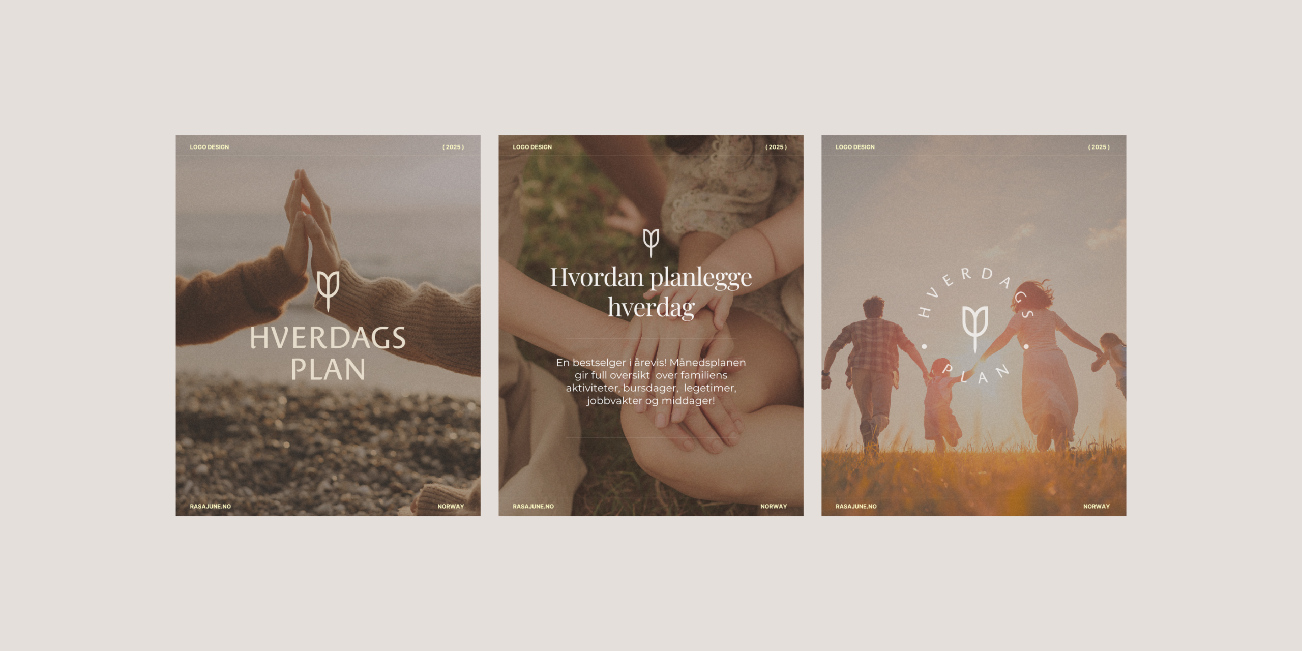
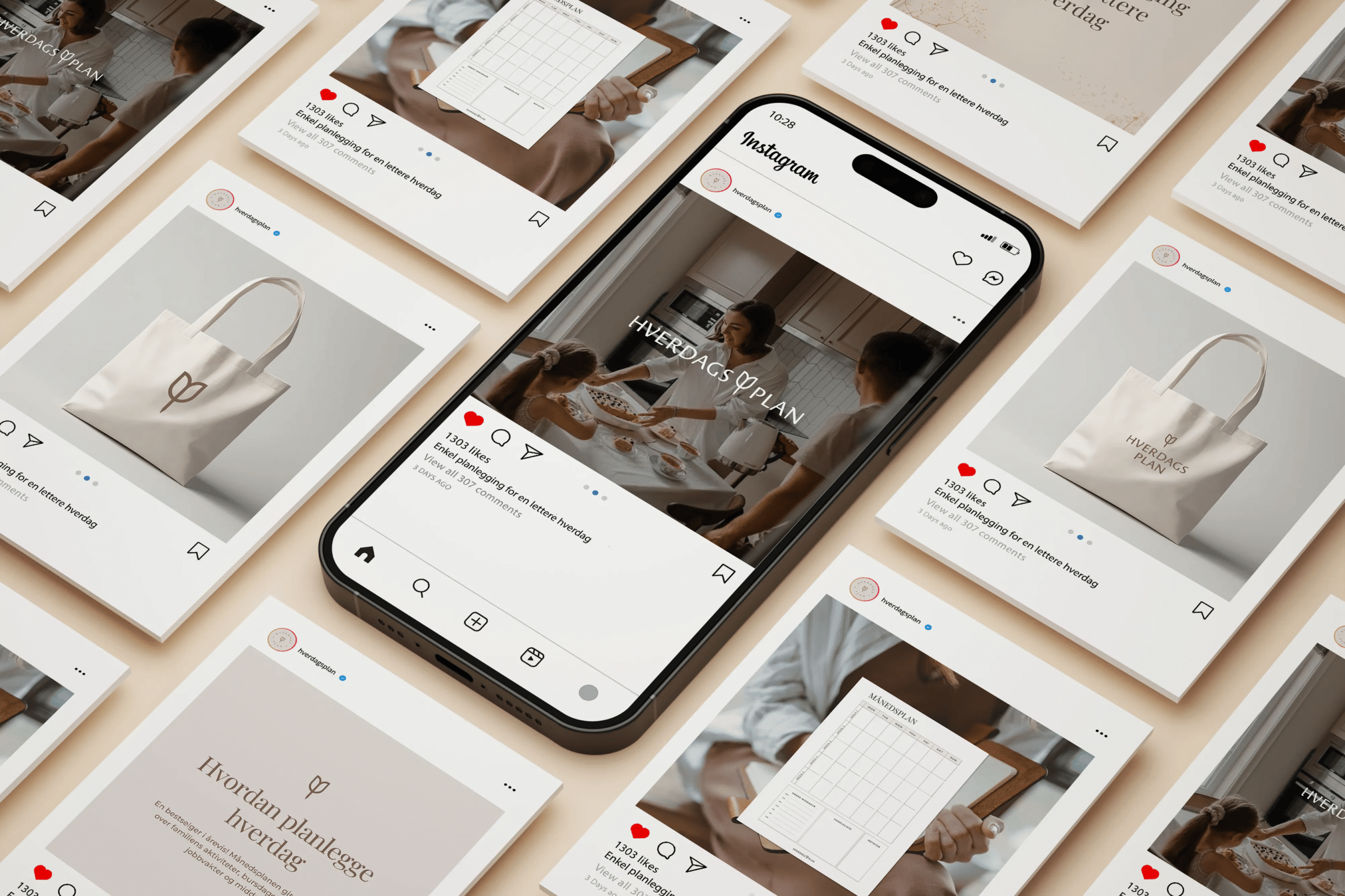
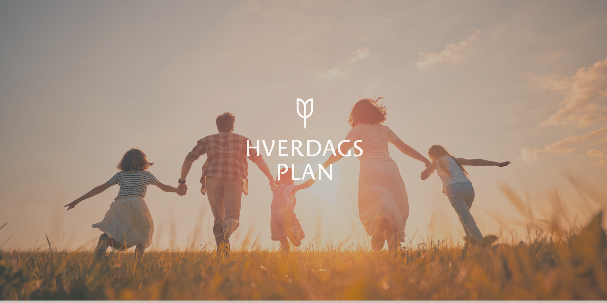
The visual identity for families was developed as a warm and flexible design system that combines structure, overview, and closeness. Logo, typography, color palette, and graphic elements are developed to create a calm and recognizable expression that reflects Hverdagsplan's idea – to make everyday life a little simpler. .
The flexible design system gives the brand a clear common thread – from the boards and packaging to the website and social media.
The process
From idea to identity
From name and idea to finished identity – in four steps.
The idea in focus
The starting point was the name and the idea behind it: creating clarity in everyday life. The boards had to be readable at a glance – by children too.
Three concepts
Hverdagsplan was presented with three concepts, each with its own logo and visual direction.
Chosen direction
The chosen direction was developed into a holistic identity with logo, colours and typography.
Complete delivery
The entire identity was delivered together – ready for use on boards, packaging and digital channels.
The result
The result is a cohesive visual identity with a new logo, colour palette, typography and graphic elements that give Hverdagsplan a warm and recognisable expression. The design system balances structure and closeness, and gives the brand a flexible visual foundation – from the magnetic boards on the fridge to packaging and digital channels. The identity is in use today, and the client is very satisfied with the result.