Case study
Bauhaus Urban Studio
Visual identity for architecture firm Bauhaus Urban Studio – developed to create a distinctive, modern, and cohesive expression.
- DELIVERABLES
- Visual Identity · Logo Design · Digital Design
- YEAR
- 2024
- CLIENT
- Bauhaus Urban Studio
The Brief
Visual identity for a modern architecture firm
Bauhaus Urban Studio needed a visual identity that could convey a modern and professional expression, while the brand should have a distinctive character of its own. The goal was to develop a flexible visual system that creates recognition and functions consistently across different platforms.
The idea
Form follows function
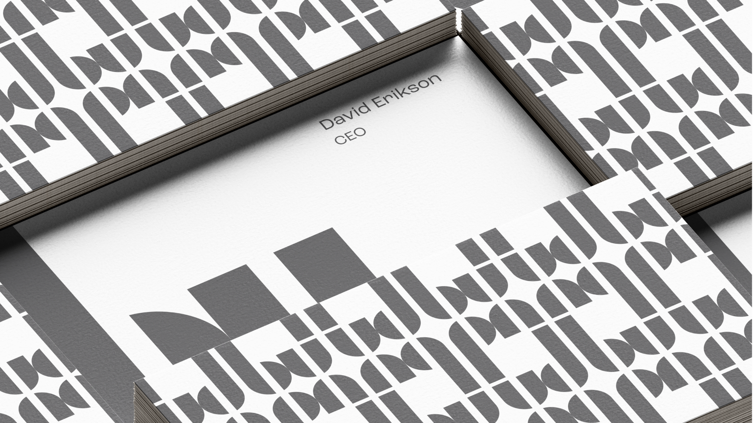
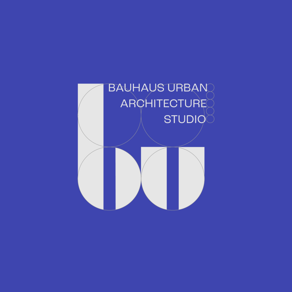
The Bauhaus school taught us that good form grows out of function. That became the starting point for the identity: a monogram where the letters b and u are built from simple geometric shapes – straight lines, curves and clear proportions.The result is a mark as precise as an architectural drawing, and as easy to recognise on a sign as in a small icon on screen.
The Solution
A visual language inspired by structure and geometry
The visual identity is built on a simple and geometric visual language, with clear references to Bauhaus principles. Logo, typography, color palette, and graphic elements were developed as parts of one cohesive design system, where function and visual character are balanced. The system gives the brand a distinctive expression and can easily be adapted to both digital and physical platforms.
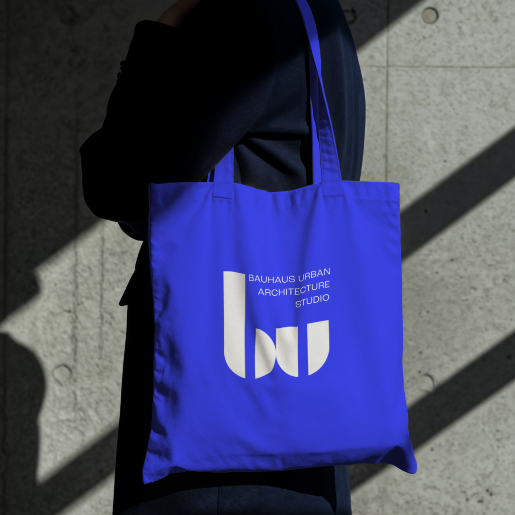
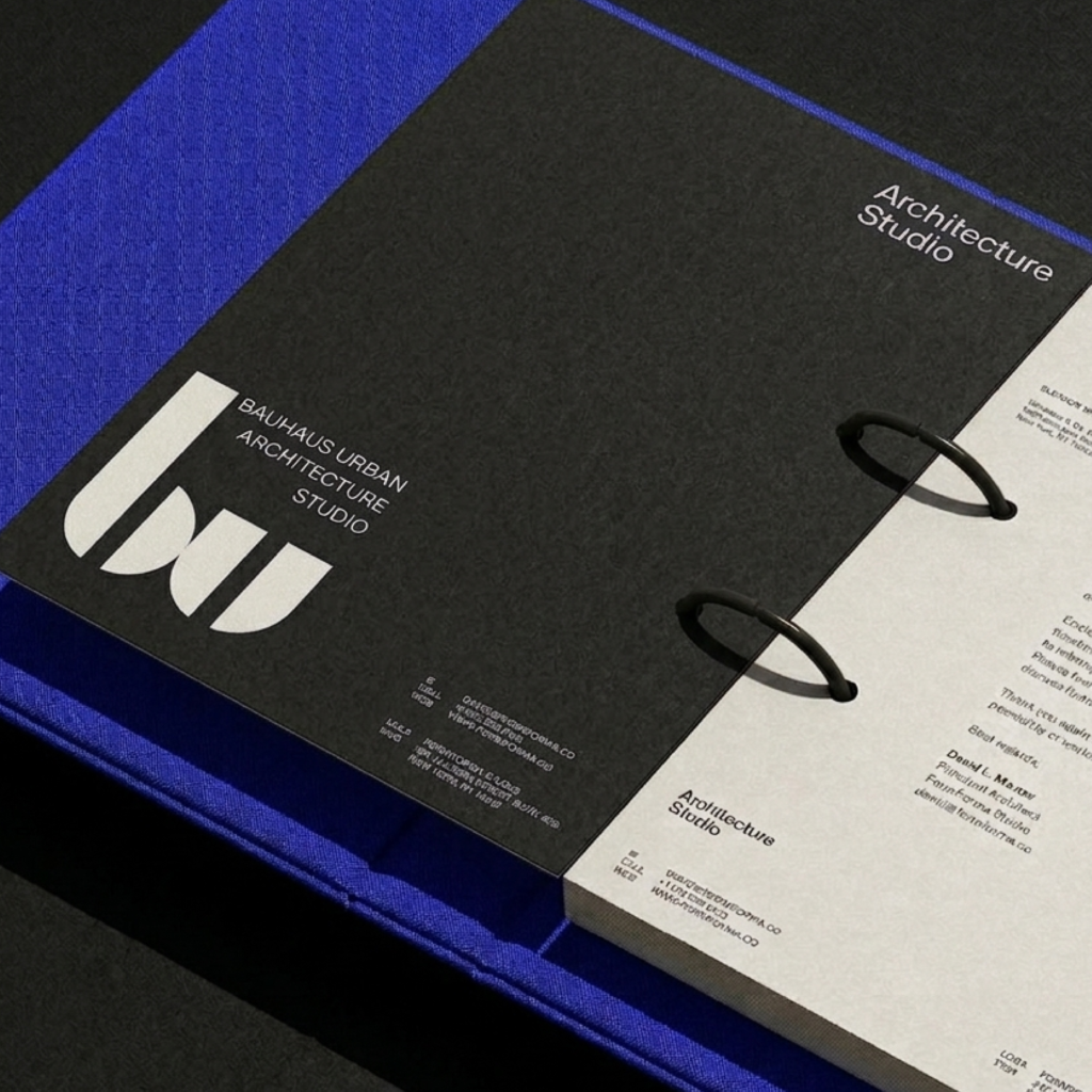
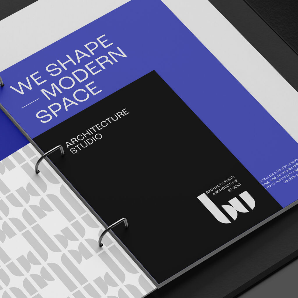
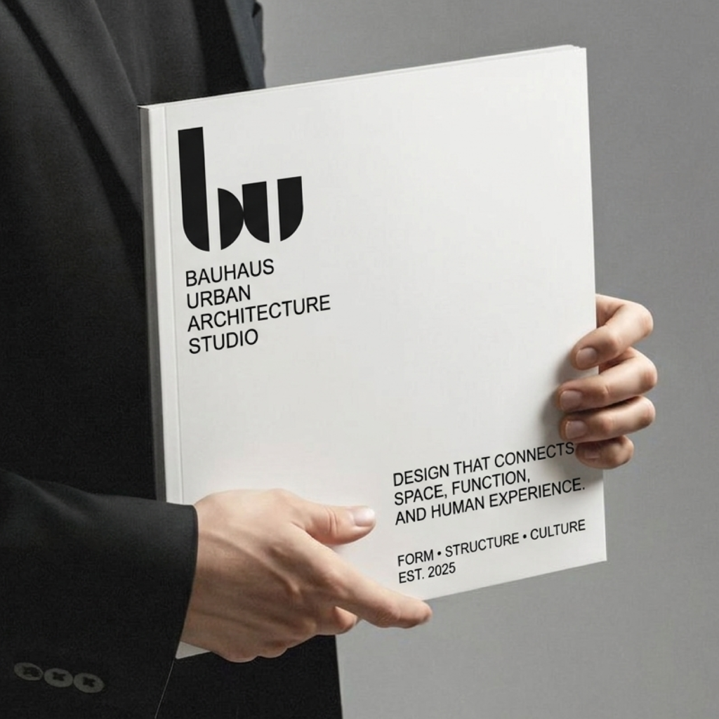
Logo
The logo is built around the letters “B” and “U,” with geometric shapes and proportions inspired by the golden ratio. The distinctive visual language reflects the Bauhaus principles of functionality, balance, and simplicity.
The design system
Built from the same basic shapes
Four elements that together create a clear and recognisable expression.
Monogram
The letters b and u are composed of the same basic shapes, so the mark feels built – not drawn.
Typography
Clear, modern letterforms that bring calm and clarity, in headlines and longer text alike.
Colours
A clear blue together with white and grey creates a bold and confident expression.
Application
The system is designed to work on print, signage, presentations and digital platforms.
The result
The result is a modern and recognizable visual identity with a new logo, typography, color palette, and graphic elements. The flexible design system gives Bauhaus Urban Studio a consistent expression and a visual foundation that can be further developed across different formats and touchpoints.